Google launched a limited beta of its new social network service, Google+ (pronounced Google Plus) on Jun 29 amid much fanfare from the tech community and sites such as Engadget.
I managed to get an invite to the beta, which was closed hours after its launch due to overwhelming response, and spent some time exploring the features of Google+, to find out what makes it different from Facebook.
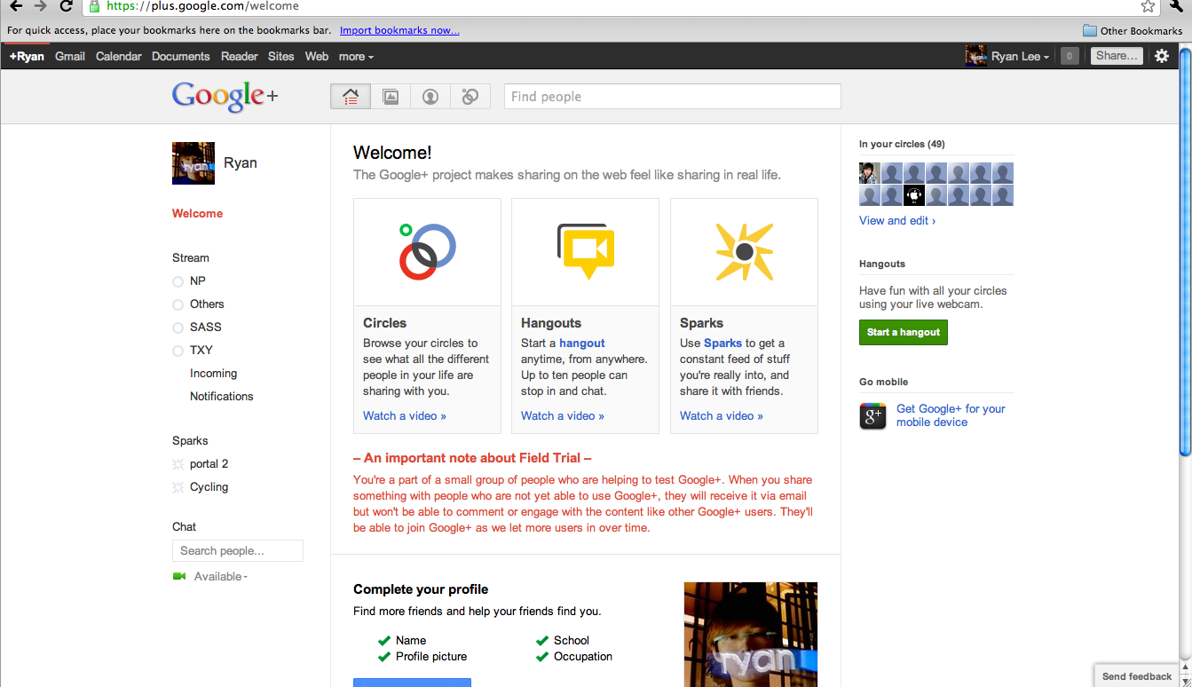
The user interface of Google+ is divided into 4 major tabs: Home, Photos, Profile and Circles.
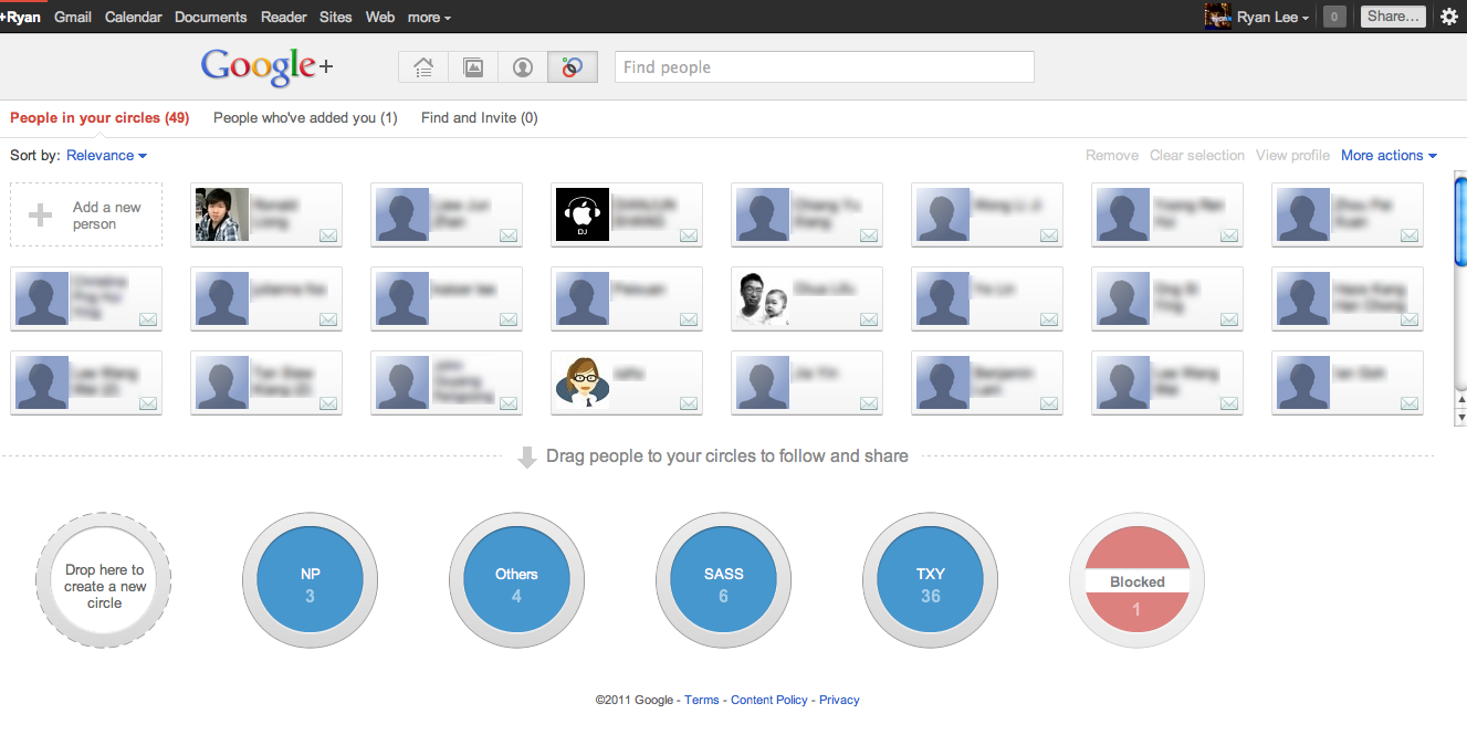
Circles
Although Circles is the last tab, it’s the most important function in Google+ and will be explained first.
Similar to lists on Facebook, Circles is Google+’s core feature, where you can organize and mirror your networks online nearly as well as you do offline.
So in my friends’ list are 4 circles: My secondary school ex-classmates, Ngee Ann Polytechnic classmates and friends, external CCA and “others” for random acquaintances (we all have them). There’s also a default “blocked” circle for those you don’t want to interact with.
Google+ automatically lists contacts from your Gmail’s (http://mail.google.com/) address book into your friends’ list, which you can easily drag and drop into one or more circles (handy if you have a friend in 2 or more of your networks).
Although you can add anyone into your circle, you can’t remove people who have added you to their circles, nor see the name of the circle you have been added into by others. This is where the “blocked” circle becomes useful as a workaround to the one-way friends’ lists.
Home
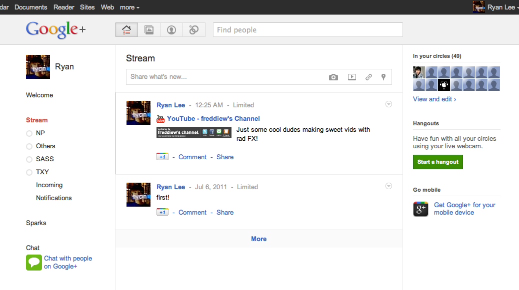
The home page on Google+ is extremely similar to that of Facebook’s, with a news feed streaming posts from your circles and options to view content only from specific circles. A major difference, however, is that the feed sorts itself by last activity (meaning comments or +1 – Google’s version of starring articles) instead of latest posted. It would be nice to add an option here, much like Facebook’s “Most Recent” and “Top Posts”.
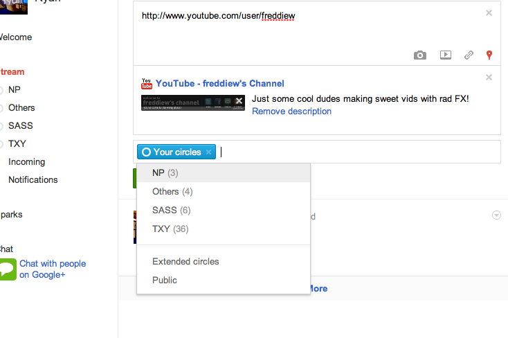
As one would expect, this is the page where status updates or sharing of articles take place. What’s new and a useful addition to the posting option is the circles feature. This is where you decide which circles are able to view your post. For example, I’d post photos of my class memories within my secondary school circle but not my external CCA circle, as these would be irrelevant to my CCA friends.
There’s also a chatting platform for interaction with online users, which is built on Google Chat (http://www.google.com/talk/) (the same one which you find in Gmail). I wasn’t able to test if there can be simultaneous, updated conversations on Google+ and Gmail at the same time as I didn’t have any friends in the beta.
Profile
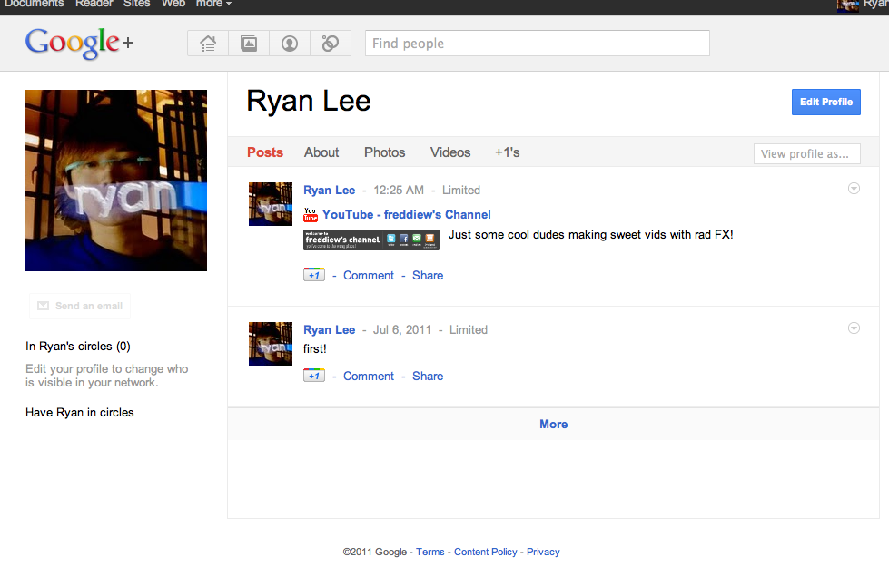
Placed on the profile page are the standard elements you’d see in almost all social networking sites. There is a posts section, where all your posts (and only yours) are reflected here, together with the privacy/circle settings, which you published them with.
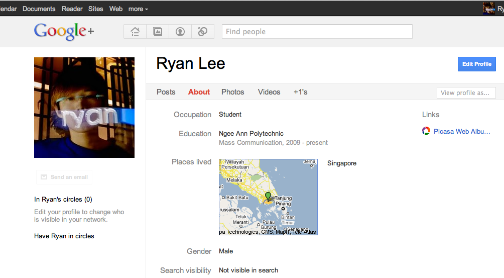
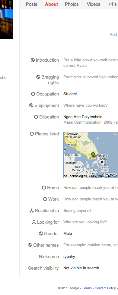
The about page is very condensed compared to Facebook’s: it only asks for a few things such as a brief introduction, occupation, hometown, education and so on.
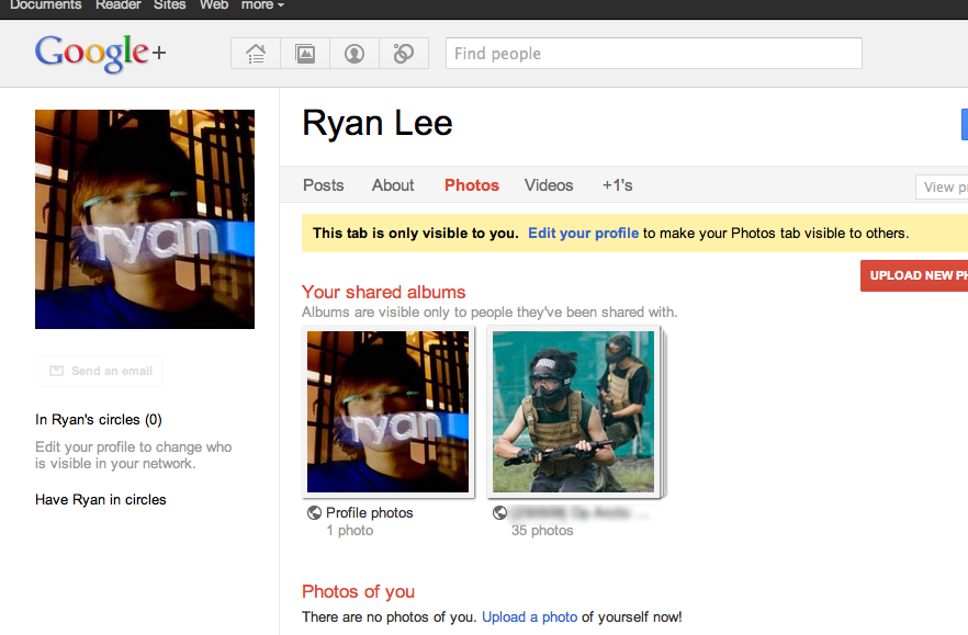
There are also the obligatory photos and videos pages, where friends in your circles can view your multimedia uploads. You can also choose to hide these tabs if you don’t want them to be seen publicly, but only when you post them to your stream or link them to your friends.
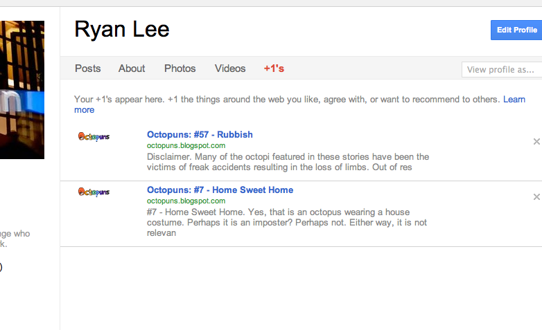
The last tab displays your posts from Google +1 (http://www.google.com/+1/button/), which is a feature brought over and integrated from Google Profiles. Google +1 works much like the “favorite” button on YouTube (https://www.youtube.com), or the article-starring system in ReadItLater (http://readitlaterlist.com/) or Instapaper (http://www.instapaper.com): it saves the article into your account and posts them automatically on your Google+ page. However, there’s one key difference between this and the Google+ news feed: your Google +1 articles are visible to all your circles.
Photos
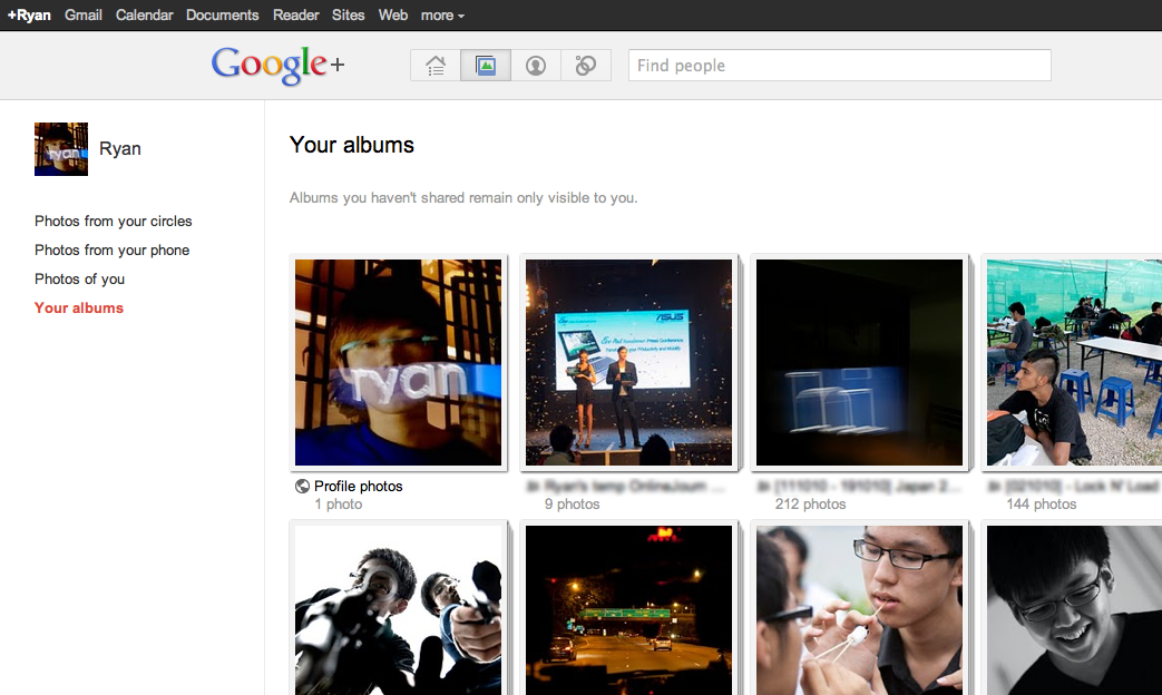
On the third tab is the photos feature. This is also a top-level tab, which comes as a surprise as you’d normally find photos hidden in a sub-tab (even more so when videos are excluded here).
In this page both your personal photos and your friends’ photos are displayed. Uploads are directly connected to your Google Picasa account, which means that changes will be reflected in both sites. Google+ also enables basic editing of photos after successful uploads, presumably through Picasa’s technology as well.
Sparks and Hangouts
Among Google+’s minor features are Sparks and Hangouts.
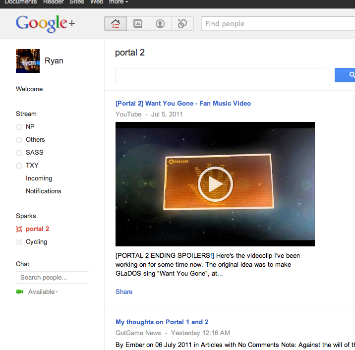
Sparks are digital newspapers that appear under your feed options. They appear under a separate feed below your circles, and when clicked, display the latest news on your selected genres from different news networks. The genres can be from a pre-defined list or generated by keywords.
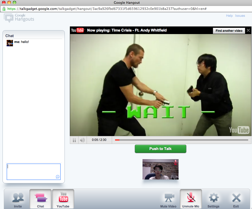
Hangouts are like virtual group outings: you start a video chat in a new window, choose which circles you want to open it up to, and wait for someone to join (your hangout will appear in others’ news feed). Your webcam, as well as that of those in the chat, are streamed live to each other by default. You can choose to turn this off, and/or use standard text chat or “Push to Talk” – in other words, an online walkie-talkie. An integrated YouTube plugin also allows sharing of YouTube videos with everyone in the same hangout.
Summary
Overall, Google+’s features seem to be built from (even against, in some cases) Facebook’s existing functions. This may be attractive to users who are tired of the complicated settings and privacy problems of Facebook, but by itself aren’t enough to draw everyone over from Facebook.
Google’s decision to go head-to-head against Facebook is a bold one, but much more needs to be done for it to be a real Facebook “killer”. This is the limited beta, after all, and this is the best time for Google to be gathering feedback from the selected users so more features may be added and tweaked before Google decides to release it for all to use.

